Scaling Engagement and Interactivity
TLDR - check out the new site
One of the first posts I wrote about on this blog was about a community aggregate site for designers in the Tampa Bay area.
I quickly spun up a fairly static site using Next.js and a bunch of custom styles, linking to Google Forms to collect any info or updates.
Since the launch in Sprint 2020 → Jan 2021, I've had over 400 visitors and 5,000 sessions. While there aren't a ton of designers in the area, I wanted to increase engagement between each other, rather than exponentiate on the number of visitors.
My goal for the TampaBay.design is:
Increase engagement between the designers in the area and provide a simple, aggregate method to find resources, local-ish job openings, interviews, and other designers.
Here's what it looked like before:
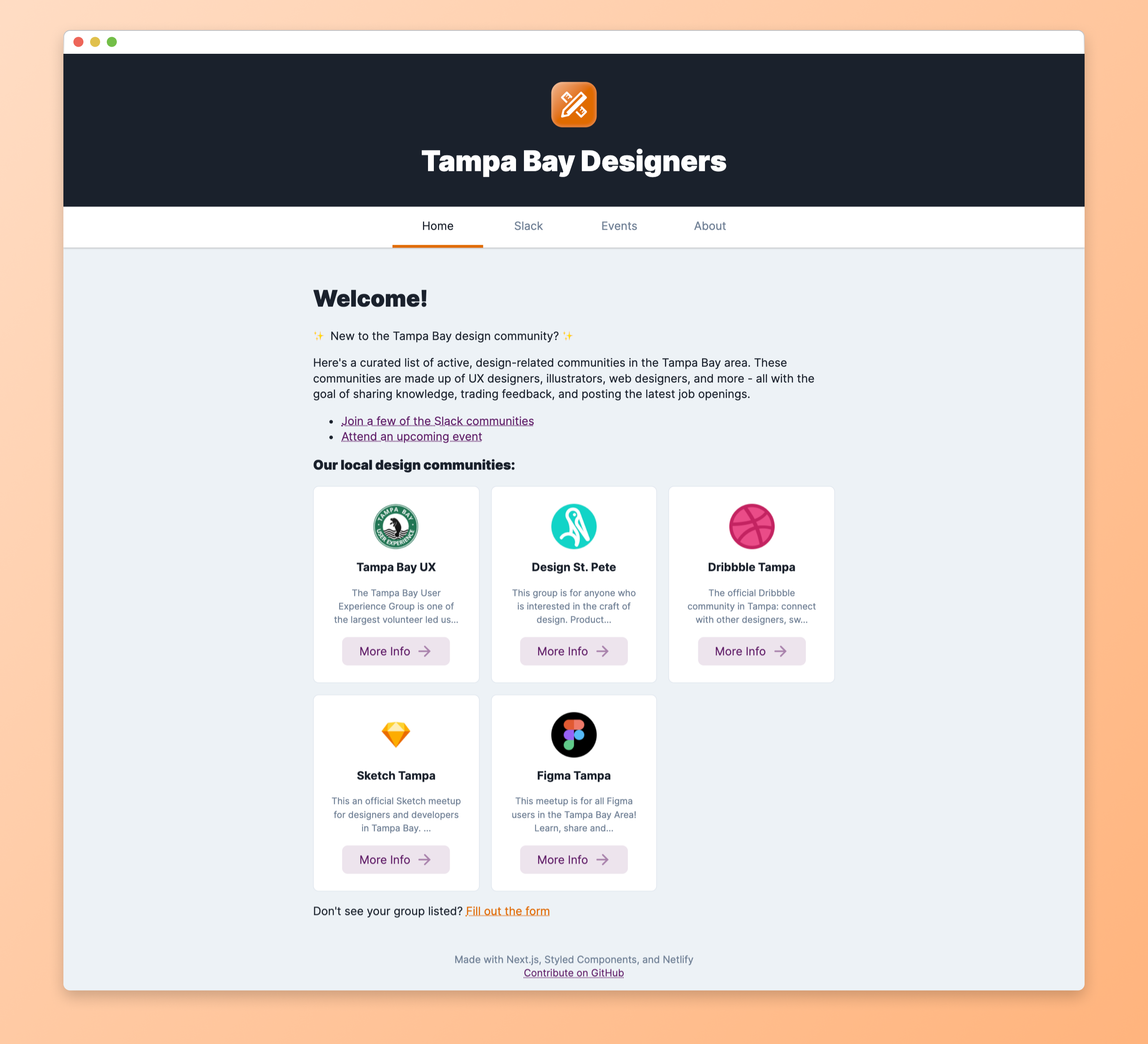
Although the site was informative for finding groups in the area, it wasn't solving the problem designers (new and old) around the area were still experiencing.
- Where can I find designers in the area?
- What jobs are open for designers in Florida?
- What resources are other local designers finding helpful?
- Which design events are happening around me?
Separating Data from Design
Before, I simply listed organizations and slack groups statically - as well as linking to a few Google Forms for receving input for new events, slack groups, or organizations.
Why don't I just throw all of the data in Airtable?
I was using Airtable to list events and thought to add all of this data (and more) in Airtable rather than render statically.

I created an Airtable base and added a few different tables to store the data:
- events
- slack groups
- organizations
- designers
- and a few more
I was also really enjoying using TailwindCSS on another project and thought to rebuild this site with it as well.
To design/build the new site, we're going to use:
- Figma for ideating
- Next.js for the front-end
- TailwindCSS for styles
- Feather for icons
- Framer Motion for sweet animations
- Airtable to store data
- Netlify to deploy
Let's take a look at the new site
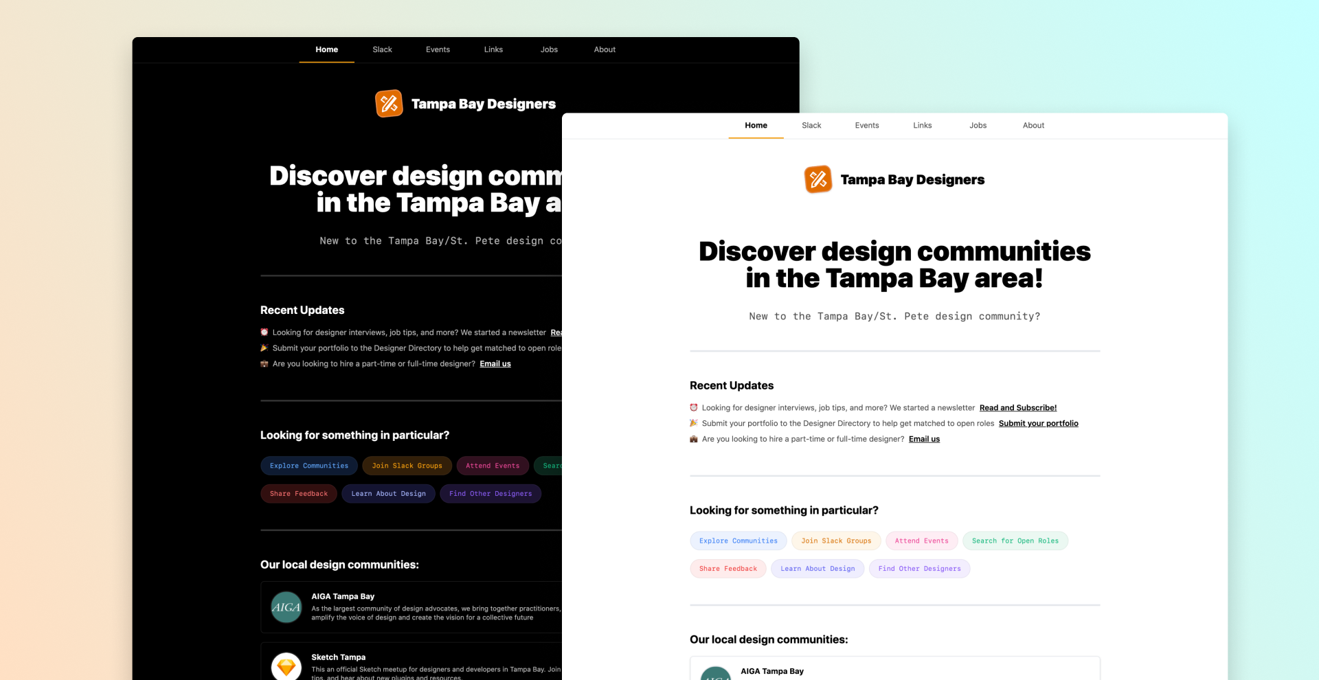
So we rebuilt the site, and to help increase regular engagement, we added more contextually informative sections:
- Submit your portfolio if you're looking for a job?
- Are you looking to hire a designer?
- Read our weekly newsletter for new design resources!
I also added a light and dark mode, based of the user's OS theme.
Visually, I opted to create starker color contrast and spacing to allow for more breathing room for the increase in content.
On-site engagement
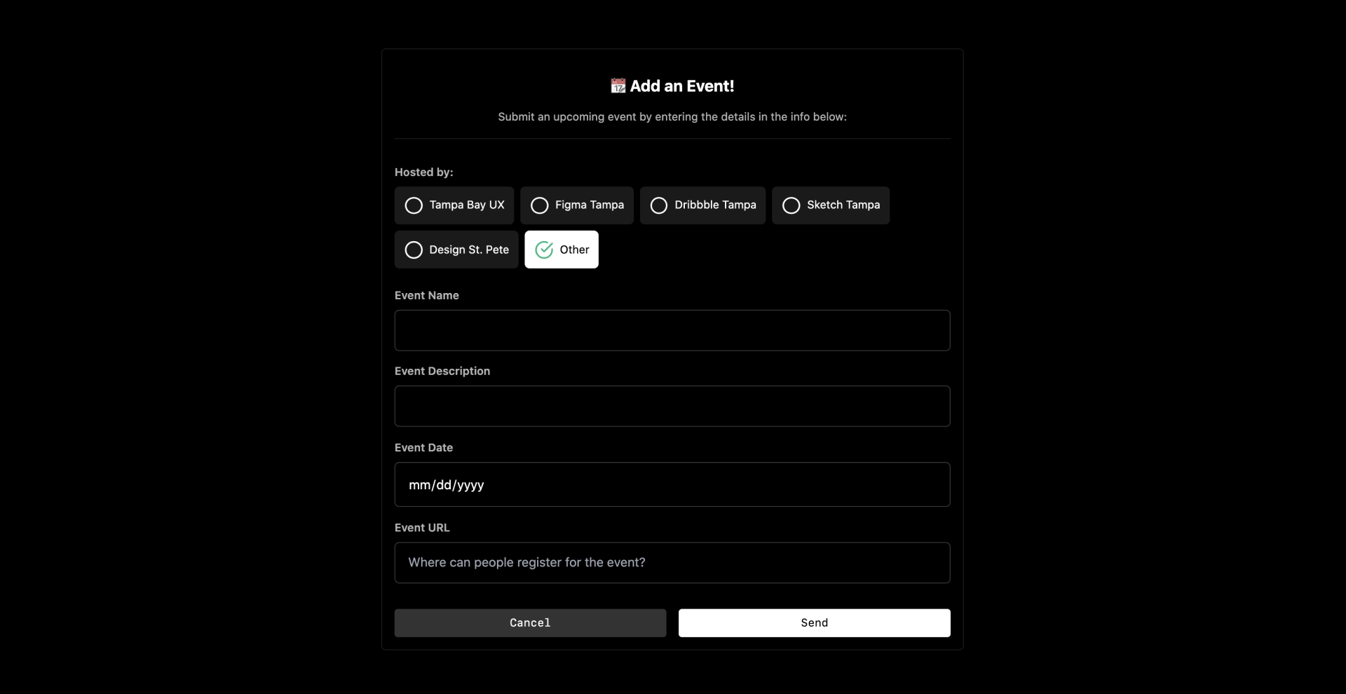
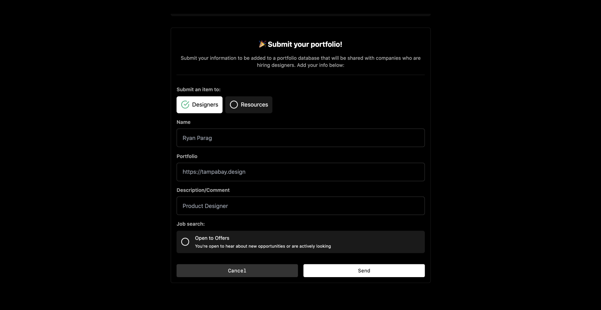
To help make the information updates more seamless, I converted the Google Form links to interactive forms that directly connected to Airtable:
Using the same method, I wanted to provide a way for those on the job hunt to be added to a list and update their job search status:
There's a ton more to go over, but rather than go through the detail of every change, check out the new site!
Hopefully that was helpful in case you want to do the same for your community, or even if you want to help contribute on this website. I'll keep updating this site with more features that could be helpful to other designers in the area, but if you have an idea, ping me using the form below - I'd love to hear about your ideas.

